Design
Here is a collection of works ranging from both Advertising & Marketing productions, Web Design, Product Design and Social Media Marketing content that I've worked on. Most notably, being the unique design style and techniques used for each project such as Graphic Design (including typography, images, and colors), Motion Graphics used in video production, advertising, and web design, Mixed Media Design (combining different variety of media like photographs, illustrations, paintings, etc.), UX and UI design used for web design, and web page layout.
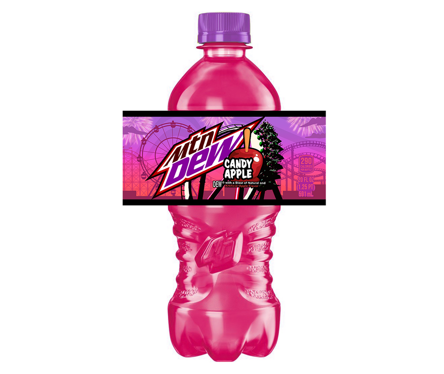
MTN DEW - packaging design for a new MTN Dew flavor concept. Inspired by the sweet and tart essence of classic candy apples, aimed to capture the spirit of summer fun and nostalgia.
Client : PepsiCo for MTN DEW
Role : 3D, Graphic Design, Product Packaging Design, and Brand Identity
Brand Identity: A vibrant and energetic design that captures the spirit of summer
Embarking on a new flavor exploration for PepsiCo, I set out to design the packaging for a new flavor concept for MTN DEW : Candy Apple. Inspired by the vibrant energy and nostalgia of a summer fair, the design celebrates the sweet and tangy essence of the candy apple, capturing the magic of those unforgettable summer nights.
Visual Storytelling: Delving into the essence of the Candy Apple flavor and sunsets at the County fair
I envisioned a visual narrative that evoked the joyous atmosphere of a busy county fair. The central image depicts a breathtaking sunset, its hues mirroring the molten caramel of a candy apple. Silhouettes of iconic fair attractions – Ferris wheels, swirling roller coasters, and concession stands – add a playful touch, transporting consumers to the heart of the summer carnival experience. I also wanted dazzling fireworks which paints a picture of pure summer fun and unforgettable memories. With a focus on a juicy, candy-coated apple further emphasizes the flavor, enticing consumers with its sweet and refreshing promise.
Sunset Hues: inspired from the breathtaking sunset that paints the sky during a county fair, the packaging utilizes a vibrant blend of pink, red and purple hues, evoking a sense of intimate joy and excitement.
Amusement Park Imagery: The design features whimsical illustrations of roller coasters, Ferris wheels, and iconic amusement park rides, capturing the adrenaline-pumping energy and youthful spirit of summer.
Sparkling Fireworks: Bursting fireworks add an extra layer of festivity and excitement to the design, symbolizing the celebratory spirit of summer nights.
Product Design: Target Audience
This design targets the adventurous spirit of MTN DEW's core audience – young adults who embrace bold flavors and seek out unique experiences. The vibrant colors, playful imagery, and nostalgic references resonate with their desire for excitement and discovery.
Tools used to create this project
3D Modeling and Design: Utilizing cutting-edge 3D modeling software, I created realistic and visually appealing renderings of the soda cans, adding depth and dimension to the packaging design.
Adobe Illustrator: Creating intricate vector graphics and illustrations that aligned with MTN DEW's brand identity while remaining distinct and relevant
Adobe Photoshop: Enhancing the visual appeal of the packaging design through photo editing and manipulation.
Adobe After Effects: Employing a range of animation techniques, including keyframing, masking, and dynamic transitions, to bring this packaging Design to life.
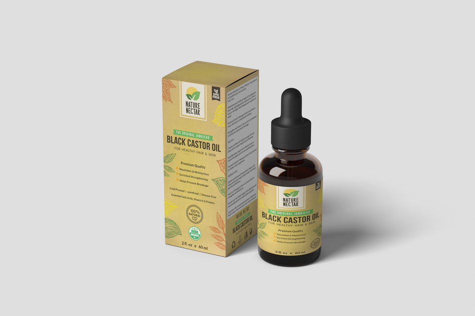
Nature Nectar - is an all-natural beauty oil brand that uses only the purest ingredients to create products that are good for your skin and hair.
Client : Nature Nectar
Role : Product Packaging Design, Brand Identity, Graphic Design, and Social Media
Brand Identity: Amplifying Nature Nectar's Voice
This product packaging design project aims to create a beautiful and effective package that reflects the brand's values. I've used natural materials and colors to create a sense of peace and tranquility.
Design Concept: Embracing Nature's Harmony
Earthy tones, reminiscent of lush landscapes formed the foundation of the color palette, while subtle textures, inspired by the delicate touch of petals and leaves, added a touch of tactility. In keeping with Nature Nectar's commitment to sustainability, I opted for natural materials that exuded a sense of authenticity and eco-consciousness. Recycled paper, with its subtle imperfections, served as the primary substrate, while accents of brown and glass added a touch of elegance and sophistication.
Typography: A Harmonious Blend of Clarity and Appeal
The typography is simple and elegant, and the overall design is modern and sophisticated. Selecting elegant and legible typefaces are important to enhance the readability of product information.
Functional Product Design: Enhancing Usability and Protection
The goal of this product packaging design is to create a package that is not only beautiful but also functional. The package will need to be easy to use and store, and it will also need to protect the product from damage. The design will also need to be eye-catching and appealing to potential customers.
The design will help to promote the Nature Nectar brand and its all-natural beauty products.
Tools used to create this project
Adobe Illustrator: Creating intricate vector graphics and illustrations that captured the essence of nature's beauty.
Adobe Photoshop: Enhancing the visual appeal of the packaging design through photo editing and manipulation.
Color Psychology: Employing color theory to evoke emotions of harmony, tranquility, and naturalness, reinforcing the brand's commitment to Nature.
NYU - Motion graphic design project for NYU's Alumni program. The idea was to make digital thank you greeting cards to Email to their donors and subscribers, also to spread awareness of their Stewardship program.
Client : New York University (NYU)
Role : Motion Design, Typography, Brand Identity, Email Marketing and Creative Direction
Motion graphics that seamlessly integrated with NYU's brand identity
A global leader in education, sought to enhance its Alumni program by creating a series of captivating digital thank-you greeting cards for its esteemed donors and subscribers. This motion graphics project serves as a lasting legacy of NYU's commitment to appreciating its donors and subscribers while promoting the value of the Stewardship program. As NYU continues to engage its alumni community, these motion graphics will continue to play a vital role in fostering a culture of gratitude, stewardship, and unwavering support for the university's mission of excellence. By skillfully blending creative vision with technical expertise, I successfully crafted a series of motion graphics that not only expressed gratitude but also inspired alumni engagement and support for NYU's Stewardship program.
-
Brand Identity Alignment: Carefully studying NYU's brand guidelines, ensuring that the motion graphics seamlessly integrated with the university's established visual identity.
-
Target Audience Understanding: Gaining a deep understanding of NYU's alumni demographic, their interests, and their expectations for a digital thank-you experience.
Tools used to create this project:
Adobe Illustrator: Creating intricate vector graphics and illustrations that aligned with NYU's brand aesthetic.
Adobe After Effects: Employing a range of animation techniques, including keyframing, masking, and dynamic transitions, to bring the motion graphics to life.
Color Psychology: Leveraging color theory to evoke emotions of gratitude, warmth, and connection, reinforcing the message of stewardship.
Typography: Selecting impactful typefaces that complemented NYU's brand identity and enhanced the readability of the messages.
HRO Today - Motion Design project to spread awareness of a leading HR industry publishing company's magazines, web portals, research,
e-newsletters, events, and social networks.
Client : HRO Today
Role : Motion Design, Typography, Infographics, Corporate, Brand Identity, and Marketing
HRO Today, a leading HR industry publishing company, sought to create a captivating motion design campaign to amplify awareness of their comprehensive suite of HR resources, including magazines, web portals, research, e-newsletters, events, and social networks. As a Motion Designer, I embarked on a journey to craft a visually engaging and informative campaign that would effectively communicate the value proposition of HRO Today and its commitment to empowering HR professionals.
-
Brand Identity Alignment: Carefully studying HRO Today's brand identity, ensuring that the motion design campaign seamlessly integrated with the company's established visual language.
-
Target Audience Understanding: Gaining a deep understanding of HRO Today's target audience, their interests, and their preferred learning styles.
Tools used to create this project
Adobe Illustrator: Creating intricate vector graphics and illustrations that complemented HRO Today's brand aesthetic.
Adobe After Effects: Employing a range of animation techniques, including keyframing, masking, and dynamic transitions, to bring the motion graphics to life.
Typography: Selecting impactful typefaces that enhanced the readability of the messages while aligning with HRO Today's brand identity.
Data Visualization: Utilizing infographics and data visualization techniques to present complex HR concepts in a clear and engaging manner.
Artificial Werld ® - Creative direction for a Lifestyle brand that is on a mission to highlight and celebrate diversity & inclusion.
Client : Artificial Werld ®
Role : Creative Direction, Brand Identity, Design, Photography, Editing, and Marketing.
Brand Identity: Human Connection Through Fashion
In the realm of lifestyle brands, Artificial Werld ® stands out as a beacon of inclusivity, championing diversity and celebrating the unique beauty of every individual. As Creative Director, I embarked on a mission to translate the brand's core values into a captivating visual narrative, a symphony of images that would empower individuals and amplify their voices.
Marketing: Amplifying the Message of Diversity and Inclusion
The marketing strategy for Artificial Werld's ® brand imagery focused on amplifying the message of diversity and inclusion. The images were showcased across a variety of platforms, including social media, print advertisements, and the brand's website, ensuring that the brand's commitment to inclusivity was visible to a global audience.
Photography and Editing: Capturing and Refining the Essence of Diversity
To capture the essence of diversity, I carefully selected a diverse group of models, each representing a unique background, ethnicity, and personal style. The photography was conducted in a variety of settings, from bustling city streets to serene natural landscapes, reflecting the brand's global reach and its ability to connect with individuals from all walks of life.
Creative Direction: From Concept to Creation
Through a blend of creative direction, photography, design, editing, and marketing, I successfully amplified Artificial Werld's ® voice as a champion of diversity and inclusion. The brand's imagery, a symphony of unique individuals, continues to inspire individuals worldwide, reminding us that our differences are not barriers but rather the threads that bind us together, creating a rich tapestry of human connection.
I've used a variety of design tools, including Adobe Illustrator, Adobe Photoshop and Adobe Lightroom to produce this project.
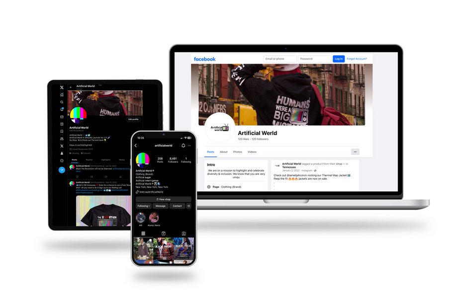
Artificial Werld ® - Social Media + Email Marketing and Web Design for a Lifestyle brand.
Client : Artificial Werld®
Role : Social Media Marketing, Web Designer, Creative Direction, Brand Identity
-
Social Media Marketing: Leveraging the power of social media platforms, including Instagram, Facebook, and Twitter, I crafted engaging and informative content that highlighted Artificial Werld's ® products. Engaging visuals, captivating storytelling, and strategic community engagement were huge in driving traffic to Artificial Werld's ® website and fostering a loyal following of new enthusiasts.
-
Web Design: With a keen eye for aesthetics and an understanding of user experience, I reimagined Artificial Werld's ® website, transforming it into a visually stunning and user-friendly digital hub. The website showcased the brand's style in a clear, concise, and visually appealing manner, seamlessly guiding visitors through its vast array of offers.
-
Creative Direction: As a creative director, I spearheaded the development of a cohesive brand identity that permeated every aspect of Artificial Werld's ® digital presence. From the selection of impactful imagery to the crafting of compelling brand messaging, I ensured that Artificial Werld's ® unique voice and vision resonated with their target audience.
-
Brand Identity: At the start of my approach, I needed to gain a deep understanding of Artificial Werld's ® core values and aspirations. I meticulously crafted a brand identity that reflected the company's innovative spirit, unwavering commitment to creativity, and passion for pushing the boundaries of diversity while breaking the curse of technological dissidence.
I've used a variety of design tools, including Adobe Illustrator, Adobe Photoshop and Adobe Lightroom to produce this project.
Artificial Werld ® - Designing an identity for a Lifestyle Fashion Brand. With the concept based on Heat Mapping technology and a dedicated mission to connecting all people.
Client : Artificial Werld®
Role : Design, Brand Identity, and Creative Direction
A Brand Identity that Connects the World
An innovative lifestyle fashion brand, embarked on a mission to create a brand identity that reflected their unique concept of Heat Mapping technology and their dedication to connecting people worldwide. By seamlessly integrating the concept of Heat Mapping into the brand's visual language and communications strategy, I successfully created a brand identity that not only differentiated
Artificial Werld ® from competitors but also resonated with their global audience.
Concept Exploration: Delving into the Depths of Human Connection
To fully grasp the essence of Artificial Werld ®, I delved into the depths of Heat Mapping technology, exploring its scientific principles and its implications for human connection. This exploration revealed a profound analogy between Heat Mapping and human interaction, where individuals radiate warmth and energy, creating a network of interconnectedness that spans the globe.
Visual Identity: Developing a visual language of Colors, Patterns, and Textures
The visual identity of Artificial Werld ® emerged from the concept of Heat Mapping, manifesting in a vibrant color palette inspired by thermal imagery. Deep reds, oranges, and yellows represented the intensity of human connection, while cooler shades of blue and green symbolized the calming and unifying power of human interaction. Patterns, reminiscent of interconnected networks, adorned the brand's garments, reflecting the intricate tapestry of human relationships. Textures, evoking the warmth and comfort of human touch, were carefully selected to enhance the brand's tactile appeal.
Design Execution: From Concept to Creation
The journey from concept to creation was a meticulous process, guided by a deep understanding of Artificial Werld's ® vision. The logo design, a harmonious blend of geometric shapes and evocative colors, captured the essence of Heat Mapping and the brand's commitment to connection.
The signature jacket and crossbody bag, designed with intricate patterns and textures inspired by Heat Mapping, became tangible expressions of the brand's identity. These garments, crafted with the finest materials, were designed to not only reflect the brand's values but also to empower individuals to embrace their unique place in the larger world.
I've used a variety of design tools, including Adobe Illustrator, Adobe Photoshop and Adobe InDesign to produce this project.
Hey Captain Pet Shop™ - Building a Website for all furry friends. Making a User friendly interface for the average pet parent.
Client : Hey Captain Pet Shop™
Role : UI UX Design, Logo Design, Web Layout, Brand Identity
A start-up pet store, sought to establish an online presence that would cater to the needs of modern pet parents. Recognizing the importance of user-centric design, they engaged my expertise to create a website that would not only showcase their extensive range of pet products but also provide an exceptional user experience. For this Project I was able to translate the user's needs into effective and engaging user interfaces.
-
User Research: Conducting in-depth user research to understand the needs, preferences, and pain points of Hey Captain Pet Shop's ™ target audience.
-
Information Architecture: Developing a well-structured information architecture that ensures easy navigation and quick access to relevant information.
-
User Interface (UI) Design: Crafting a user-friendly interface that prioritizes simplicity and intuitiveness, employing clear typography, consistent design elements, and intuitive navigation.
-
User Experience (UX) Design: Designing a seamless user experience that guides pet parents through their journey, from product discovery to checkout, ensuring a positive and frustration-free experience.
-
Visual Design: Creating a visually appealing and consistent design that reflects Hey Captain Pet Shop's ™ brand identity, incorporating warm tones, playful graphics, and pet-friendly imagery.
Tools used to create this project
Adobe Illustrator: Creating versatile vector graphics and illustrations for a cohesive visual identity.
Figma: Designing interactive prototypes and wireframes to test and refine user flows.
Sketch: Generating high-fidelity mockups to visualize the final product.
Adobe XD: Developing interactive prototypes for usability testing and gathering user feedback.
Peace and Luck - Designing the posters for an Angel Number series focused on meditation and self-help.
Client : Peace and Luck
Role : Graphic Design, Typography, Art Direction
In the realm of spirituality and self-help, angel numbers hold a unique significance, believed to carry messages of guidance, encouragement, and support from our celestial guardians. Embracing this concept, Peace and Luck, a brand dedicated to promoting serenity and personal growth, embarked on a journey to create an evocative series of posters, each centered on a specific angel number. The posters invite viewers to embark on a visual meditation, immersing themselves in the calming aura of each angel number.
Color Psychology: Painting the Aura of Angel Numbers
Color psychology played a pivotal role in establishing the visual identity of each angel number. Soothing blues and violets were employed to represent tranquility and spiritual awakening, while vibrant oranges and yellows symbolized energy, optimism, and personal empowerment.
Evoking Emotions and Inspiring Change
The Angel Number Poster Series stands as a testament to the power of design to evoke emotions, convey messages, and inspire positive change. By thoughtfully considering color, typography, and composition, the posters successfully capture the essence of each angel number, creating a visually stunning and meaningful collection that promotes peace, well-being, and personal growth.
A Cohesive Brand Identity: Reinforcing Peace and Luck
Throughout the series, a consistent design aesthetic was maintained, ensuring a cohesive and memorable visual identity. Minimalism, elegance, and a touch of mysticism permeated each poster, aligning perfectly with the Peace and Luck brand.
I used Adobe Illustrator, Adobe InDesign, and Adobe Photoshop to create this project.
Personal Designs - Here are some of my personal designs.


